Cover Characteristics is a meme by Sugar and Snark- every week a characteristic is selected and we post 5 books with that week's theme.
This week's pick- Retro
Going rogue again- this week I am taking a look at books with retro covers. And since SciFi Month begins tomorrow I'm getting a bit of an early start as these are all SF books.

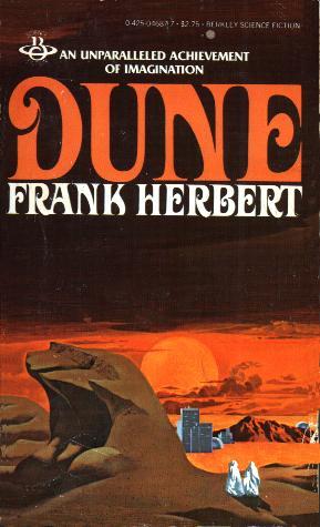

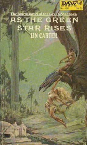
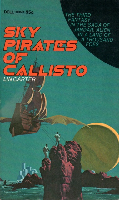


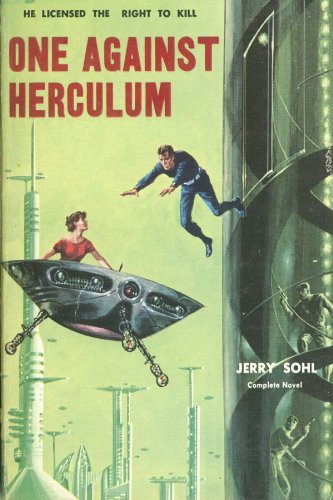

A favorite cover of mine.


This isn't really a retro cover as it's a fairly new release, but it has that retro feel for me.


Love the cover- and especially the city in the bottom right corner, which is easy to miss.


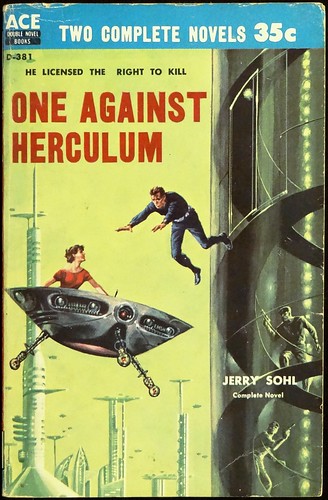
Old sci-fi covers can be the best and cheesiest at the same time. Sometimes I just love looking at them and seeing what elements I can discover. The Time Traders looks like a giant Christmas ornament floating in water to me :)
ReplyDeleteI know! And you're right- it totally looks like an ornament floating in water. I had not even realized that, but now that you mention it you're so right! lol
DeleteI love retro sci-fi covers! I like how you can immediately tell they're sci-fi. A lot of newer covers you could possibly mix up with fantasy or crime, as they don't have that signature style that sci-fi covers used to have.
ReplyDeleteI do too. Some are pretty bad but others are so evocative too. And yes they are definitely sci fi- you're right sometimes especially with newer YA SF sometimes it's kind of ambiguous? Like it COULD be SF but it might be something else too?
DeleteRetro sci-fi, nice! It's interesting how these retro covers all have that similar look. But they do feel very sci-fi. I was thinking the same thing as Laura that it seems like these have a more obvious sci-fi feel than today's covers (although maybe I just don't happen to look at a lot of super sci-fi-y books). But these are fun! The Star Born one is my favorite :-)
ReplyDeleteThanx! And you're right- they do all share a certain something, that old school feel. I know what you mean they were just more unabashedly SF somehow. I think maybe because they were illustrated rather than being just generic sorta art or model studies or whatever. Maybe that's why dos Santos' stuff is s good- he's an illustrator.
DeleteStar Born is my fave too- it has that sense of wonder. The way the ship is offloading stuff, and there's people in the hatches or windows or whatever- I just love all the touches.
NICE. Retro fantasy and/or sci-fi covers are so much fun to look at sometimes. (When they're not too cheesy, I mean.) I don't know how "retro" this is compared to the covers you shared, but my copy of Ursula K. Le Guin's The Dispossessed is this one here: https://www.goodreads.com/book/photo/13651.The_Dispossessed
ReplyDeleteOn a fantasy note, I also have one of the older covers for Gabriel's Sabriel and Lirael books. They're from the 1990s, so they're "younger" than the books you shared, but their covers have that "throwback" feel to them. Here are links to those, if you're interested.
Sabriel: https://www.goodreads.com/book/photo/518848.Sabriel
Lirael: https://www.goodreads.com/book/photo/47645.Lirael
Thank you. And I agree- there is something about the old covers. :) I have not seen any of those covers before- thanks for sharing them. They do indeed have that throwback vibe- I agree.
DeleteSci-Fi definitely tends to do retro well! Thanks for sharing. :)
ReplyDelete-Lauren
I agree! Thanks for visiting! :)
DeleteYou can totally picture how the entire book looks--the yellowing pages, the smaller size, the slightly funky smell. These remind me of the copy of The Martian Chronicles we read in 7th grade in the very early 1980s.
ReplyDeleteHa so true- picking stuff up like this in a used bookstore they would totally have that old book smell and feel. :)
DeleteI love the cover for Star Born, it is very futuristic looking.
ReplyDeleteI think so too- it sort of has that retro future look, if that makes sense. :)
DeleteI have the first three Dune paperbacks as a boxed set and that is the cover style! :D
ReplyDelete