Cover Characteristics is a meme by Sugar and Snark- every week a characteristic is selected and we post 5 books with that week's theme.
This week's pick- Arrows
Arrows- a staple of fantasy. And that's where most of my picks come from this week. From the rogues and highwaymen who prowl the forest lanes to the assassin or green cloaked rangers, fantasy has all kinds of archery going on. So this was a fun topic this week.
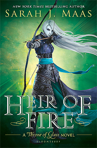
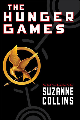




I like this cover of all the Hunger Games variants I've seen. Simple yet effective, and the black and gold works nicely.

A quintessential ranger in the woods image.

Kind of a silly fantasy cover but it has that old school feel.

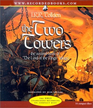
The audiobook cover of The Two Towers. No shortage of arrows in this one.
I love that last image! The peacefully grazing unicorn and the weapon laden skeleton...oy!
ReplyDeleteI like that one a lot too!
DeleteWow you found a lot of covers! I have Heir Of Fire and The Hunger Games on my list as well... I think Heir Of Fire is my favorite out of these, although I really like the Dragon magazine cover too.
ReplyDeleteThat Dragon magazine cover is my favorite, when I saw it I was like oh yeah- something about the unicorn and the skeleton. :)
DeleteNice picks this week, I never thought of Hunger Games. I love the Heir of Fire cover....in fact I love all the covers in this series.
ReplyDeleteThanks for stopping by :)
Thank, you too Michelle! :)
DeleteGreat picks! I think Heir of Fire is my favorite. I love the color and the layout of it. The Dragon magazine is a close 2nd. I love the calm unicorn with the grizzly skeleton!
ReplyDeleteI like that one too, something peaceful about that magazine cover.
DeleteI am not a big fan of the Heir of Fire cover, but it is a nice pose. I think my favorite of these is the Ranger's Apprentice cover. I think my sister has read that series. The Dragon Magazine cover is a good one too!
ReplyDeleteI like the Ranger's cover too, very archery ish or something.
DeleteI also like Heir of Fire since I included that in my list too. I forgot about The Hunger Games though! Simple yet striking. And I really like Ranger's Apprentice. He looks are mysterious and rogue-ish.
ReplyDeleteBut, you know, I gotta say, I didn't know that Tarzan used bows and arrows lol. You learn something new every day :-P
Ranger's Apprentice is a good one, just a classic archery type dude. I like the green background and the silvery leaf kinda lettering.
DeleteAnd Tarzan... you know I read that I think last year as a retro read and I'm not sure he even uses a bow in the story lol. But I like the cover... :)
I also thought of The Hunger Games! Where do you get all your books??? Always such an interesting selection. I've just posted mine as well. Enjoy the rest of your week!
ReplyDeleteI do a search if I don't think of any (or enough). I think some people only use books on their TBR or tha tthey've read but I don't do that. I look wherever. :)
DeleteI like that Hunger Games cover too! I'm not entirely sure if I like Heir of Fire or not. I'm not sure, but I just can't seem to settle on a yes or no.
ReplyDeleteThe Dragon magazine one is my favourite too. I like a little bit of the macabre in my covers. Especially if it's skeletons - although they have to be anatomically correct or I'll complain a lot...
I do like Heir of Fire, although I haven't read it. And I love that Dragon mag cover- there's something calm about it even with the skeleton and his weapons. :)
DeleteI'm always so excited whenever I see arrows on a cover, it just immediately brings to mind a fantasy series and hopefully an action-packed on as well.
ReplyDeleteGreat picks!! I really like the Heir of Fire cover. Then again I love all her covers. :D
ReplyDeleteI like the look of Maas' book covers. I also like the unicorn and skeleton.
ReplyDeleteOoh, that magazine cover is awesome!
ReplyDeleteWhat great fantasy covers!
ReplyDeleteI agree that The Hunger Games cover is very nice and simple. It catches the attention more than the others do. :)
ReplyDeleteI almost went with The Hunger Games as well! Great pick!
ReplyDeleteCheck out my Covers
I mean, you totally had me at The Hunger Games, of course! I DO like the original black and gold one. But... I think either the Luxury Editions or the neon ones win for me. Fun fact: The ARC has no arrow. And the writing is silver.
ReplyDeleteAnd I love Heir of Fire because of the green too! It's my favorite cover of the series because I LOVE how well the green works with the other elements! Oh, and I am probably going to have ALL the nightmares about the creepy skeleton next to the unicorn. Just saying ;)
I love the cover for the Hunger Games, it's just so clean and stylish looking. I do also love Heir of Fire cover as the mc looks fierce! Dragon is very eye catching as well, so much detail that it makes me look twice.
ReplyDeleteHeir of Fire is my favorite. Great picks!
ReplyDeleteThanks for joining in last week :)
Sugar & Snark
Have you read any of Charles Moffat's books? What did you think of them?
ReplyDelete