The island takes everything

Top Ten Tuesday is a weekly feature hosted by That Artsy Reader Girl. Each week a new Top Ten list will be posted. Everyone is welcome to join. Link back so everyone can check out other bloggers' lists. It's a fun way to get to know fellow bloggers.
This week is Top Ten cover redesigns that are loved / hated. Ooh fun topic. I could have fun with this, and get all ranty, but I'll endeavor to remain calm.
So for these I think I like all three, although the second two are probably my faves- they just seem more SF oriented?
The Mars books by Edgar Rice Burroughs- there have been so many versions over the years- most of them bad- although I love the one above- especially all the details when you see the unfiltered art- the second version is newer and it's okay but there's not much to see?
I think I like the second cover better here, although the first one has that quirky old school vibe.
I definitely like the original illustrated covers more.
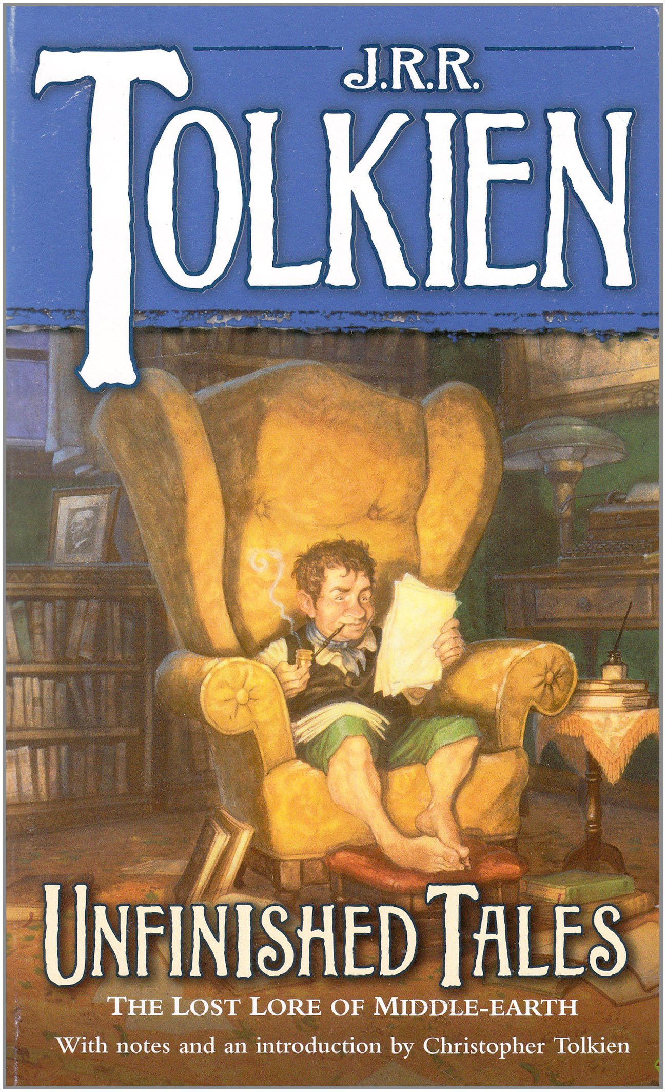
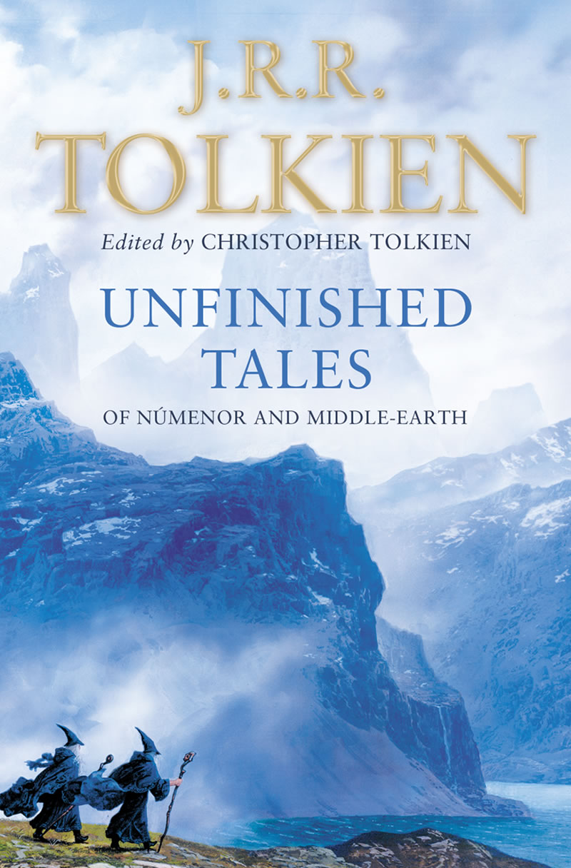
I love both of these covers although the first one is my fave.
Okay granted these aren't much different lol.
I love both of these.


I know these aren't redesigns so much as different publishing houses but it's still fun to compare!


Don't think I've seen that The Hunger Games one, but do agree. They're essentially the same. Ooo, and I like the purple in the 'Shannara' cover art! :) I know nothing about "Vitro," but do think the first one is more striking!
ReplyDeleteGreat list. I agree that new ones are nicer and stuff but I have such a love for those old, quirky looking books. Most of the time I don't get them because the print is too small in those but the covers are so much fun!
ReplyDeletewww.tbrandbeyond.com
You had both some dramatic choices and some subtle changes. Interesting choices. My cover redesign of classics
ReplyDeleteAcross the Universe's original cover was my preferred one. I don't know why, I think it's the romantic in me, although the book isn't really that romantic. :)
ReplyDeleteI like the first vitro cover the best because it has some uniqueness to it.
ReplyDeleteThe old Sword of Shanarra book reminds me of the old Dragonlance books.
ReplyDeleteI feel a love for graphic novels in your choices Greg LOL
ReplyDeleteI always preferred the original Across the Universe cover. The colors and the ""spacey" background always drew me in. (Even though I didn't love the book and never continued the series.) Love the original Vitro cover. Very cool. And The Hunger Games has always seemed to be gifted by the cover gods. Every cover change I've seen for the series has been awesome!
ReplyDeleteI JUST finished Wilder Girls-- I'm so mad right now..... the ending. Just no.
ReplyDeleteAlso, Across the Universe has been through a lot and I don't think they've quite gotten it right yet.
Great list! I haven't read any of these, but I really like a lot of these covers. I especially like the covers for Unfinished Tales. They have completely different feels but are both great. Here is my Top Ten Tuesday.
ReplyDeleteThis is indeed a fun topic! I hate it when this happens with series. This is the reason why I never got into Samantha Shannon's The Bone Season series because I didn't like the new covers.
ReplyDeleteI love the cover for Unfinished Tales! It's perfect.
ReplyDeleteMy TTT.
Great list, Greg! I love the original covers of Tolkien's book and also GRRM's book--I've never actually seen the original until now lol I also really like the original of The Sword of Shannara. That old school vibe definitely makes me want to pick it up now!
ReplyDeleteMy TTT post
Some of those are pretty cool.
ReplyDeleteI've never read Across The Universe but the first cover gives off star-crossed lovers vibes and the other two a more gritty and adventurous vibe. I personally prefer the first :)
ReplyDeleteGreat post Greg. Here is my post-https://paigesofbook.blogspot.com/2019/08/top-ten-tuesday-books-i-just-had-to-buy.html.
ReplyDeleteI'm actually surprised The Hunger Games hasn't had a ton of cover redesigns.
ReplyDeleteI'm LOOOVING wilder Girls so far!!! I think I requested the ARC JUST because of the cover LOL you can always count on me to be utterly superficial :)
ReplyDeleteNothing raises the blood pressure of readers more than redo's of covers - especially mid series lol
ReplyDeleteI very rarely like them unless it started out as a cheap looking cover and got an upgrade. But in some cases the re-branding opens the books to new readers.
Karen @ For What It's Worth
Karen @ For What It's Worth
The new Shannara covers are cool, but I think I still like the old ones best. :)
ReplyDeleteThat's funny -- I like the first Across the Universe cover the best. Probably because it's least sci-fi and I am a romance reader. LOL.
ReplyDeleteI have the first three Shannara books in those original covers from the '80s. Ha ha. I was going to give them to charity, but then I was thinking someone might want them. 🤔
ReplyDeleteI wish the new publisher would re-release the first Wayfarers book in hardcover. 😒
I think I prefer the old Game of Thrones books better. There is something about those pictures on the front.
ReplyDeleteI love that Wilder Girls tagline. I get what you mean about the latter two Across the Universe covers being more SF-oriented, the first one is pretty, but it makes it seem more like a romance only. I love the first cover for Vitro a lot more than the remake!
ReplyDeleteAcross the Universe has made quite a few lists. I think I like the 1st and 3rd covers more than the 2nd, but all three are good.
ReplyDeleteThe original Game of Thrones cover looks kind of cringey to me, it's so dated!
ReplyDeleteYou should have used some of the REALLY different THG covers. Like the neon ones or the camo ones or... okay nevermind we'd have been here all day hah. It's so funny because I think I prefer the opposite on all the ones you had opinions on 😂 I also REALLY wish I had paid attention to the upcoming prompts because this one was VERY fun!
ReplyDeleteI think that I tend to like the original covers the best in most cases. A lot of the ones you featured here had better artwork the first time around.
ReplyDeleteI am definitely a fan of the older retro Burroughs covers! So much more personality than the second one!
ReplyDeleteThat Wilder Girls cover is phenomenal and eye catching! Hugs, RO
ReplyDeleteI don't think I've seen that bottom Hunger Games cover.
ReplyDeleteI agree about liking the original Game of Thrones covers. I also really love the hobbit sitting in the chair - how adorable but I doubt that was what they were going for!
ReplyDeleteI'm still upset about the Across the Universe redesign and the fact that my hardcovers don't match:-/
ReplyDeleteI feel like part of the reason I haven't bought Across the Universe is because of all the cover art changes, I have no idea why but ??? Haha. Also, I agree about Shannara. And, honestly, in terms of older fantasy novels I just generally adore the artwork far more than their more recently revamped designs. I mean, they aren't bad, and they're definitely modern, but I have such a soft spot for the original illustrated covers you know?
ReplyDeleteI love both of those Tolkien covers too.
ReplyDeleteI know I disagree with the Across the Universe covers, but I do agree that it's fun to compare different covers!
ReplyDeleteGreat list. I like how you added the covers together that you were comparing. Love the purple Shannara one. I don't think I've ever seen the all black cover for The Hunger Games. The first one is better.
ReplyDeleteThanks for visiting my blog.
Oooh I like most of these! Though the Original Vitro cover is super eye catching!
ReplyDeleteI totally agree about the Across The Universe covers! The first one feels more like a romance than a sci-fi.
ReplyDelete