Because I never talk book covers on this blog I thought it was high time. Okay that's obviously not true, but seriously I've been thinking lately about book covers and how they have changed- both design and artwork. I mostly read fantasy and some science fiction, but I've expanded my horizons to include contemporaries, all kinds of YA, thrillers. And it seems to me that in a lot of ways the covers are getting better and better. The only exception might be the fantasy/ SF genres- I'm not sure about this one, but fantasy/ SF covers these days are often images that only obliquely relate to the story, or don't relate to it at all. Does that matter?
Well that depends on who you ask, of course. Everyone wants or appreciates something different. For me I like a cover that shows something that happens in the story. I like it when a cover artist says they read the manuscript before painting- if they're painting. I know there are so many options now for cover art, including digital. And sometimes you get a cover that doesn't do that and it still works- it's just a nice piece of cover design. So I'd like to know what you think. And I'm going to present some covers that have changed, and would love to know- which do you prefer?
.jpg)
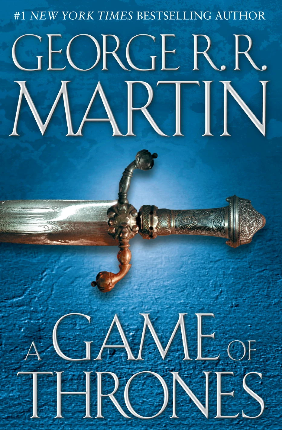



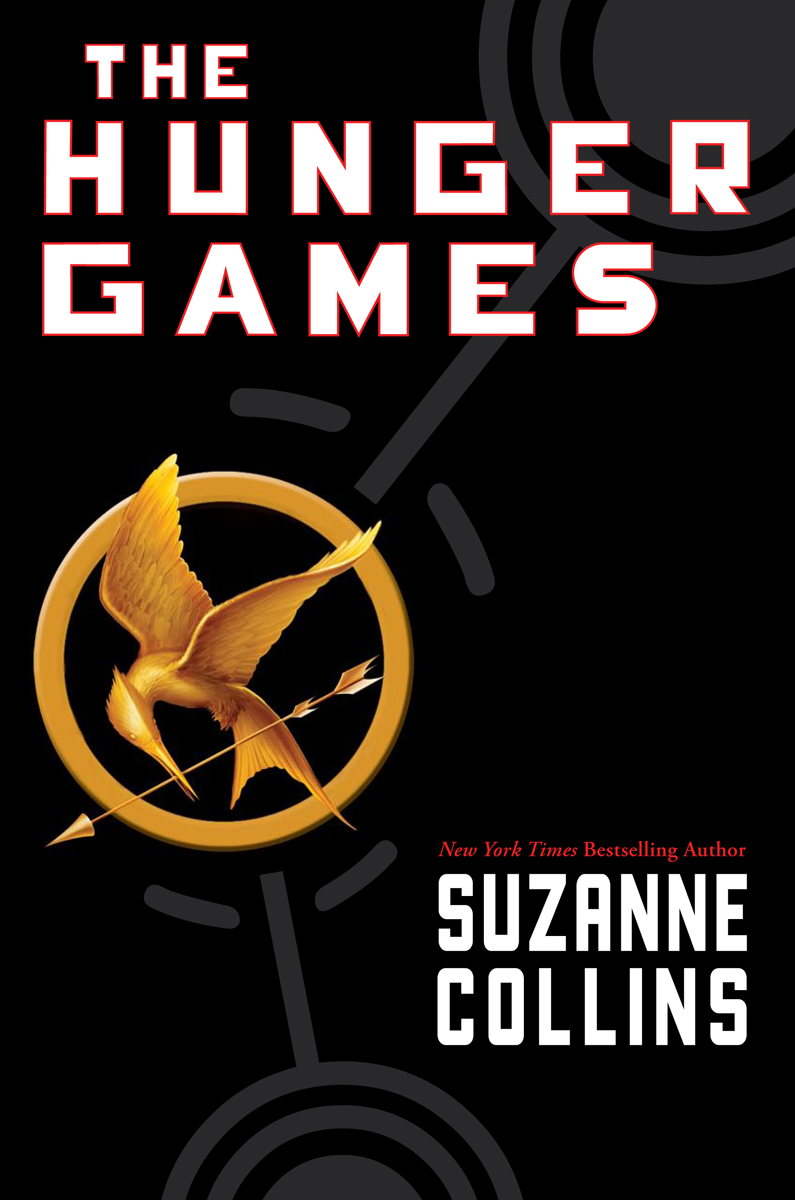
Some older cover design


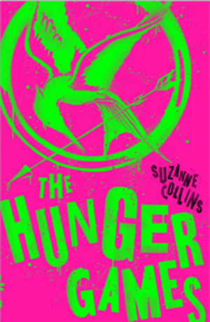
Newer cover design


Some nice ones! I didn't know about the pink hunger games one
ReplyDeleteIt's different isn't it??
DeleteOk that pink Hunger Games one is kind of awful? It hurts my eyes. And it doesn't fit the book at all with those crazy, neon colors. Looks like it should be some fun, teenage contemp or something.
ReplyDeleteI do like when covers relate really well to the story, but as long the cover represents the feel of the book, I'd probably take a cover with good design that I like over one with worse design but that matches better.
I know, crazy neon!
DeleteI agree. I mean I like a good illustration but yeah a good cover design works whether it captures the story or not.
I'm fine with either on the Game of Thrones covers, sometimes I like the simpler covers without a lot of clutter. Hate the pink Hunger Games. Then there are things like the Scorch Trials where I like the original and don't like the simplified cover, it looks more old time mystery or mission impossible.
ReplyDeleteI think you're right, I totally like that first Scorch Trials cover the best.
DeleteThe Game of Thrones covers- the same. I've always kinda favored the older one jsut because that's the one I had, but it's not a great cover. :) And the Hunger games- yeah who thought of THAT cover??
I don't like the GoT one with just the sword-that series of covers is boring so I bought newer scenic covers when I bought the series so far. I like the other one with the wolf and raven on it. That assault on the eyeballs HG one is horrific! I tend to like scenic covers or something that fits with the MC or the plot.
ReplyDeleteI'm not fond of that either. It amazes me that a series that popular didn't get a really big name artist to really do some illustrations!
DeleteHunger Games had gone through so many redesigns but I think my favourite one are the white covers. :) I like the minimalist look of them.
ReplyDeleteI kinda like the originals but I'll have to look at the white covers and see how they look!
DeleteI think the sci-fi, fantasy covers have gotten better but the old ones also have an interesting retro thing going on. They don't make covers like that anymore. Which is maybe a good thing - but interesting anyway.
ReplyDeleteThat new THG makes me cringe though lol
For What It's Worth
Yeah the retro covers can be hit or miss, definitely. Some I like and some... not so much. And I agree, I do think by and large cover design is getting better.
DeleteThat bright pink neon cover is somewhat garish isn't it??
I can't believe they would do that to The Hunger Games. Truly, what about that book says neon pink and green? Oh well. I've actually never read the series and was always content with the movies although I'm sure the books were better.
ReplyDeleteI know! I've never read them either but I'm not sure that's the cover I'd want. :)
DeleteI don't think ANYONE likes those new Hunger Games covers.
ReplyDeleteGame of Thrones just feels like an updated version. It looks good. The older one looks old because it is.
I prefer the Maze Runner series original covers.
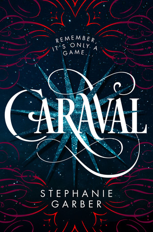
Out of all the newer cover designs Caraval wins hands down.
Ha I can't imagine why! :) Seriously though it's so garish. And yeah I think you're right, that older GoT cover definitely has an older 90's vibe to it.
DeleteI think I like the original Maze Runner covers too.
Oh, some of those newer covers offend my eyes!
ReplyDeleteHa you like the old ones eh?
DeleteWow, that old GoT cover is...old. I really hate the new Hunger Games cover. I can't believe they actually decided to go with that. It looks like ones of those deranged neon posters for Suicide Squad.
ReplyDeleteIt is! Like I said cover design, it is a- changing! And yes, you're right- that pink HG cover looks JUST like those Suicide Squad art that was everywhere for a bit. Deranged- good way to put it. :)
DeleteI only have the Kindle edition of The Hunger Games books, but have been meaning to buy physical copies of the books for ages, but I really can't decide which covers I like best (there seems to be so many editions!)! I think the darker ones are simpler and probably more in keeping with the book itself, but controversially, I do actually quite like the pink one too. You don't see all that many book covers like that out there anyway! :)
ReplyDeleteAnd I definitely like the newer A Song of Ice and Fire covers better! Unfortunately though, because I bought Game of Thrones and Clash of Kings cheap, I ended up with the TV tie-in editions, and whilst I do like the TV show, I would have preferred the non tie-in covers! Mostly because they don't match the copies of the later books in the series that I have.
I really should get a copy of the books. And I like the dark covers too, they just seem... traditional? But I don't think it's bad you like the neon cover- I kinda like it for something different, and I like how the lettering is all edgy.
DeleteI'm not a fan of tie- in cover art generally, so I agree.
I don't mind some of the newer simplified covers, but those colors in the Hunger Games... no. I also agree with you about the painted ones. I like to see that the artist has read the book and has a cover that reflects it. I think that is why I'm a fan of Dan Dos Santos covers. It always looks like he gave it a read before diving in.
ReplyDeleteHa reaction seems to be running against that bright cover! And yes I like the painted covers, and a cover that shows the book.
DeleteI think some covers are okay with simple; like the old HG cover is cool! It all depends though. I like some of the newer covers.
ReplyDeleteIt all depends. Sometimes I like the older one and sometimes the newer. I do like the older black HG cover...
DeleteI love looking at covers :D I don't think I follow any pattern on which ones grab me and which ones I could care less about. I do feel like I should be able to guess at the genre from the cover so some of them really surprise me when they don't really fit. I do know that pink Hunger Games one hurts a little.
ReplyDeleteThat's a good point, if the genre is not clear from the cover that can be a problem! And yes that HG one is a bit... bright!!
DeleteI definitely prefer the original cover of The Hunger Games; not sure of the direction they were trying to go in with the new one. My copies of the ASoIaF books have the newer covers, except for AGoT, which was the TV show tie-in version with Sean Bean as Ned on it.
ReplyDeleteI do too. I know- what were they thinking? I mean I don't hate it but consensus here definitely seems to be running against the neon variety! And I had mostly older GoT covers, although I've never really thought they had THAT great of covers.
DeleteThe pink and green Hunger Games is just plain scary, in my opinion. Yikes!
ReplyDeleteNicole @ Feed Your Fiction Addiction
HOLD. UP. First, I am reading through your comments, and 1) YOU HAVEN'T READ THE HUNGER GAMES!?!? What even!? No no no, you must remedy this IMMEDIATELY. I have 14 copies if you need to borrow one. Which language do you prefer? Korean? Chinese? Spanish? One of the English editions? The neon ones, perhaps? :D The ARC? (Just kidding you can't borrow that. ;) )
ReplyDeleteWhich brings me to point 2: The neon covers are AMAZING. Because they are so NOT the book is what makes them perfect- it's like a satire! I mean, I DO like the camo ones better, and the luxury edition best of all, for obvious reasons but STILL.
Also, yes PLEASE to all the new shiny covers. I am a fan of space covers and shiny covers. You know. Someone ought to come out with some nice, redesigned covers for The 100. They could look like the Across the Universe ones, but... bloodier. Blood and space and sparkles. Take all my money.
OH and as for the GoT covers... I mean, the new ones are better, but frankly, a series THAT huge deserves better covers in general.
The books ARE better- the movies are quite faithful, but the books are definitely next-level. Like, I have re-read them 11 times and still can be brought to tears so... yeah. There IS more fighting- the books are absolutely more violent. And the dresses/talk show part are less prominent- they have more political importance, so the focus isn't even ON the fancy stuff in the book.
DeleteThere are a lot of covers, and yep, I did a post! I am excited for whatever they do for the 10th anniversary!
I liked the original The 100 cover just because it WAS original, and after book 1, they were ALL tie-in covers. Because the book NEVER existed without the show, but they still could have given it its own cover! As much as I love the people on the show, they have people on the covers who don't even EXIST in the books! The cover for Day 21 (the original HC) is not *too* tie-in-y, but the rest are. I mean, Finn is not a thing in the books, but he is on the cover!? WHY?
Well, I like the new version of GoT better than the original one but the original isn't bad either. I definitely prefer the first version of The Hunger Games and Scorch Trials rather than the new versions. The new Hunger Games especially is really awful D:
ReplyDeleteAh yes! I owned the first Hunger Games book! Liked the black cover much more.. As for 'A Song of Ice and Fire'. I owned book 1-8 (each book was split up in 2..) in German and the versions I had were super old and they didn't make them any more. After the TV show the books all got new shiny covers but for some reason my versions were the ones still super popular. End of the story: Before I moved to Australia, I sold them on ebay for way too much money :D :D
ReplyDeleteI might be in the minority here, but I actually get the new hunger games one! Sure it's a bit . . . in your face, but it seems like they were trying to make it look a little bit more like graffiti. For the rebellion side of it!
ReplyDeleteFleur @ Frankly Books
Some of the things they do for new covers these days blow my mind. I'm a graphics designer and I see some covers and think 'I could never do that'. And I agree, I do like when a cover reflects the book - where the model actually looks like the MC or there's a specific scene from the book.
ReplyDelete~Marie @ Ramblings of a Daydreamer
I think there are highs and lows of cover design and part of it is all down to personal taste. I always notice the trends in covers. Like how The Scorch Trials looks a bit like The Hunger Games did. And there are always various trends in YA depending on genre. I do think covers are continually getting better so it makes the bad ones all the more noticeable to me. I kind of like how crazy some of the old school SFF covers are, though.
ReplyDeleteI think that second The Hunger Games cover is horrendous. Ha ha. XD
ReplyDeleteI like the second Game of Thrones cover more--with the blue. But I really really don't like the pink Hunger Games cover with the green lettering. Who thought of that? It hurts my eyes. I think the Scorch Trial covers are both good. I am not sure which I like better. I keep changing my mind. :-)
ReplyDeleteI do tend to prefer the newer covers to the older ones you shared later on though.