
Cover Characteristics is a meme by Sugar and Snark- every week a characteristic is selected and we post 5 books with that week's theme.
This week's pick- Silhouettes
This week the topic is silhouettes- interesting. There's doesn't appear to be a shortage of these covers, the only trick was narrowing it down to covers I liked. You can do so much with silhouettes- close ups, figures in the distance, different backgrounds- the sky's the limit. You can set a mood with a silhouette too- maybe that's why it's so commonly used.
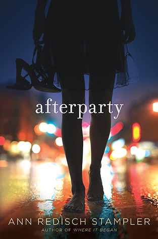





So I like this one a lot- why is she walking down the street? No idea what this is about but I'm curious.

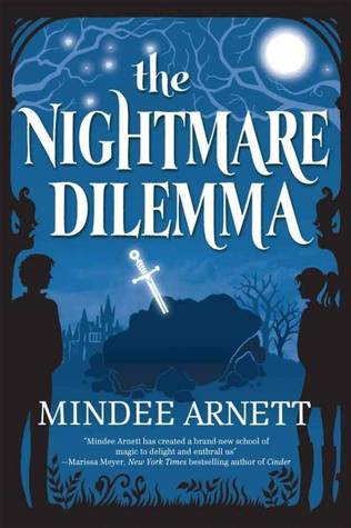
This one's okay I like the moon and the overall design, the twinkling lights or stars.

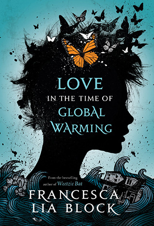
This one looks intriguing and that tagline has me curious.

This one I like a lot, one of my faves.

I kinda like this one.

I'm fond of this book although the hardcover I have has a different cover. This one is nice with the colors in the sky and the tropical island vibe.

This one's just okay.

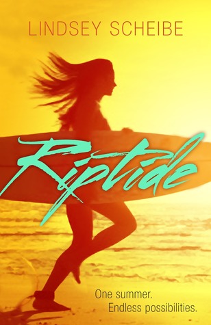
Surfing and I love the lettering and the way it tracks with the surfboard. This one might be my favorite.

Although this one might be my favorite too!

A pretty iconic silhouette cover.

Gorgeous selection Greg! I will get back to these tonight, I quickly want to post mine and then I have class for the rest of the day.
ReplyDeleteThank you, glad you liked them. Glad you joined us on this meme.
DeleteI really like the cover for Love in the Time of Global Warming too. I think that one's probably my favorite of the bunch.
ReplyDeleteI like it too, definitely one of my favorites. :)
DeleteA great mix! I love the silhouette covers because they're all so different. I think I like the spooky ones like The Distance Between Lost and Found and Night Vision best.
ReplyDeleteThere are so many good silhouette covers. The Distance Between Lost and Found is a good one, with the forest. I like it too, and Night Vision with those clouds- makes me wonder what's going on. :)
DeleteI saw Love, lies and Spies at my library, it's really cute
ReplyDeleteIt is a cute cover, isn't it?
DeleteNice mix there. I liked Love in the Time of Global Warming the best.
ReplyDeleteThat's one of my favorites as well.
DeleteI love covers with silhouettes! Great choices here. :D
ReplyDeleteThank you, it was a fun one.
DeleteOh these are all great! I like silhouettes on cover usually, they can be mysterious or a way to include a character on the cover without revealing their features or leaving that up to the reader to imagine.
ReplyDeleteThe lettering and positioning of the title on Riptide is really well done! And I like the cover for The Distance Between Lost and Found with the big imposing forest and the small figure. Great picks :)
I agree, I like the mysterious nature of them. I love Riptide, looks like a fun book ,and the forest really makes Lost and Found a good cover too.
DeleteI had a harder time with this topic than I thought I would since silhouettes are a rather common thing, and they can definitely be gorgeous when used right.
ReplyDeleteI absolutely love the Global Warming one. Definitely my favorite. Obviously I also like the Nightmare one. And you're right, the letters in the Riptide one work perfectly and really add a lot to that cover!
I thought this one might be tough but I was surprised how many silhouette covers there are. It was better for me than last week though. :) I love the Global Warming one too, as soon as I saw it I was like yup. And Riptide I just really like, the lettering and the coloring and everything.
DeleteOooh these are pretty! I love the 27 Days of Midnight one, that was new to me! I feel the girl in Afterparty though- I would have taken off my shoes too, who can be bothered? I also like Vitro a lot.
ReplyDeleteLove in the Time of GW is definitely my favorite. It's so pretty and artistic.
ReplyDeleteBeautiful selection! I like the look of After Party a lot, and also Love in the Time of Global Warming :D
ReplyDeletemy post
Sya @ Bookish Sya
These are so cool! Love in the Time of Global Warming looks so beautiful, and I *love* that title.
ReplyDeleteThe Distance is another one I really like.. and Jurassic Park - can't go wrong with that silhouette!
So glad that you like my Afterparty cover! I love it, and for me the really interesting thing is that, although the book designer hadn't read the book when the cover was conceived, the image she chose depicts a key scene in the book almost literally. The only change we made: in the original picture, the girl has champagne glasses in her hand. We photoshopped them out. My new book, How to Disappear, also has the silhouette of a girl's head and shoulders with her hair fanning out in a way that feeds into a web of scratches, almost as if the image was being scratched out.
ReplyDeleteThat's interesting that the designer managed to capture a scene so well given that they had not read it. I've always wondered how authors feel about their cover art since I know a lot of times they don't have a lot of input into it... I imagine when it works it's a great feeling! I clicked over to your blog and How to Disappear looks nice as well, I'm glad you're getting nice cover art for your books. :)
DeleteI almost did Jurassic Park. I didn't even think about Love, Lies and Spies! Great picks!
ReplyDeleteCheck out my Covers
Afterparty also has me curious. Going to go check it out on goodreads! Thanks for joining in last week :)
ReplyDeleteSugar & Snark